[Data]packaging human rights with the Universal Periodic Review
This year, the United Nations turned 75 years old. Born out of World War II and the original League of Nations, the UN has long been a symbol of international cooperation. Its General Assembly serves as the primary vehicle for multilateral policymaking, though perhaps it is most visible for its public speeches by people like South Korean boyband BTS and climate activist Greta Thunberg. The Security Council, widely known as the most powerful of the UN’s 6 organs, seeks to maintain “global peace and security”, and has been involved in every major conflict of the past century. The UN’s specialized agencies address everything from global health issues (World Health Organization) to labor protection (International Labor Organization), food and agriculture (Food and Agriculture Organization) to markets (International Monetary Fund), amongst many other humanitarian and development issues.
The 21st century has seen many well-founded critiques to the United Nations system, especially as rising nationalism worldwide has challenged the very notion of international cooperation itself. The Security Council has been increasingly been called out for its tendency to favor the will of the world’s most powerful states, and its lack of permanent representation from African or Latin American states in particular. It’s been called bureaucratic, ineffective, and expensive. The recent Black Lives Matter protests have brought issues of racism and histories of (neo)colonialism to the fore.
While addressing these developments and critiques will take much longer than a single blog, understanding what the UN has become is key to analyzing the dataset I am working with through my Open Knowledge Foundation fellowship. The open data movement has caught on in the international community, just as much as it’s taken over the world at large. The Centre for Humanitarian Data and UN Data have become key repositories for UN agencies and research collaborations, as have internal (open) databases. This past October, the UN World Data Forum gathered over 10,000 participants online, almost universally praising the open model. Open data has successfully been integrated into the international ethic, and equated with the drive for institutional transparency and accountability.
But as I said in my post during Open Access Week, open doesn’t necessarily mean accessible.
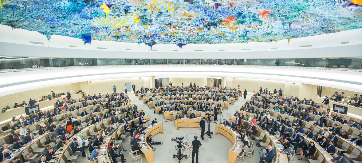
The Universal Periodic Review is one such example. The UPR was established in 2006 by the UN Human Rights Council (which had been made in turn to promote the protection of human rights around the world), both as a means through which countries could review and respond to each other’s human rights records, and as a forum for sharing best practices. Unlike the HRC, which evaluates countries collectively, the UPR allows countries to communicate more directly and in a public forum. Evaluated according to the language and laws that were codified in the Universal Declaration on Human Rights, the UPR is the only mechanism of its kind.
This might all seem like a kind of techno-babbel for human rights specialists, and it’s important to recognize what is meant by this. Part of the reason why “open” and “accessible” can’t be equated is for this exact reason: because technical subjects require translation in order to be understood at all, regardless of whether the data is “open”. All of the records for the Universal Periodic Review have been uploaded online, and are available for the public. However, it’s not likely that the everyday user would be able to make heads or tails of what it actually means.
That’s the goal of my project this year, to bring some of this data to the forefront. Why the UPR? Because it’s the only forum within a heavily bureaucratic UN for countries to speak to each other directly, and under more holistic standards. That means that Uganda might be able to speak directly to South Korea’s record on environmental rights, and vice versa. Or on the other hand, Switzerland might be able to speak to Chile’s record on press freedom, Bolivia on Mongolia’s protection of children, etc. While there are underlying politics behind this process (as with everything), which my professor at the Graduate Institute, Julie Billaud recently wrote about, I aim to visualize recommendations themselves, either given or received. My hope is that they will help us to better the UPR, and that we might learn something about “human rights” themselves mean.
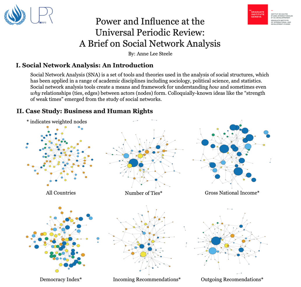
In order to do so, I plan to apply a social network analysis approach, which is a set of tools and theories that aim to understand how social structures function on a network level. These tools create a means and framework for understanding how and sometimes even why relationships (called ties or edges) between actors (called nodes) form. You know the phrase the “strength of weak ties”? That emerged from studies of social networks. It’s this network approach that I hope to apply to UPR data, along with a more journalistic-style to writing about it. I’ll be writing more about this later on, but here's an example of what a network might look like. This is from a one-pager I made this past spring, using their dataset on business and human rights (BHR) as a case study. The dots (nodes) represent countries, and their size is weighted. The lines? Those are human rights recommendations, either given or received, as they relate to BHR.
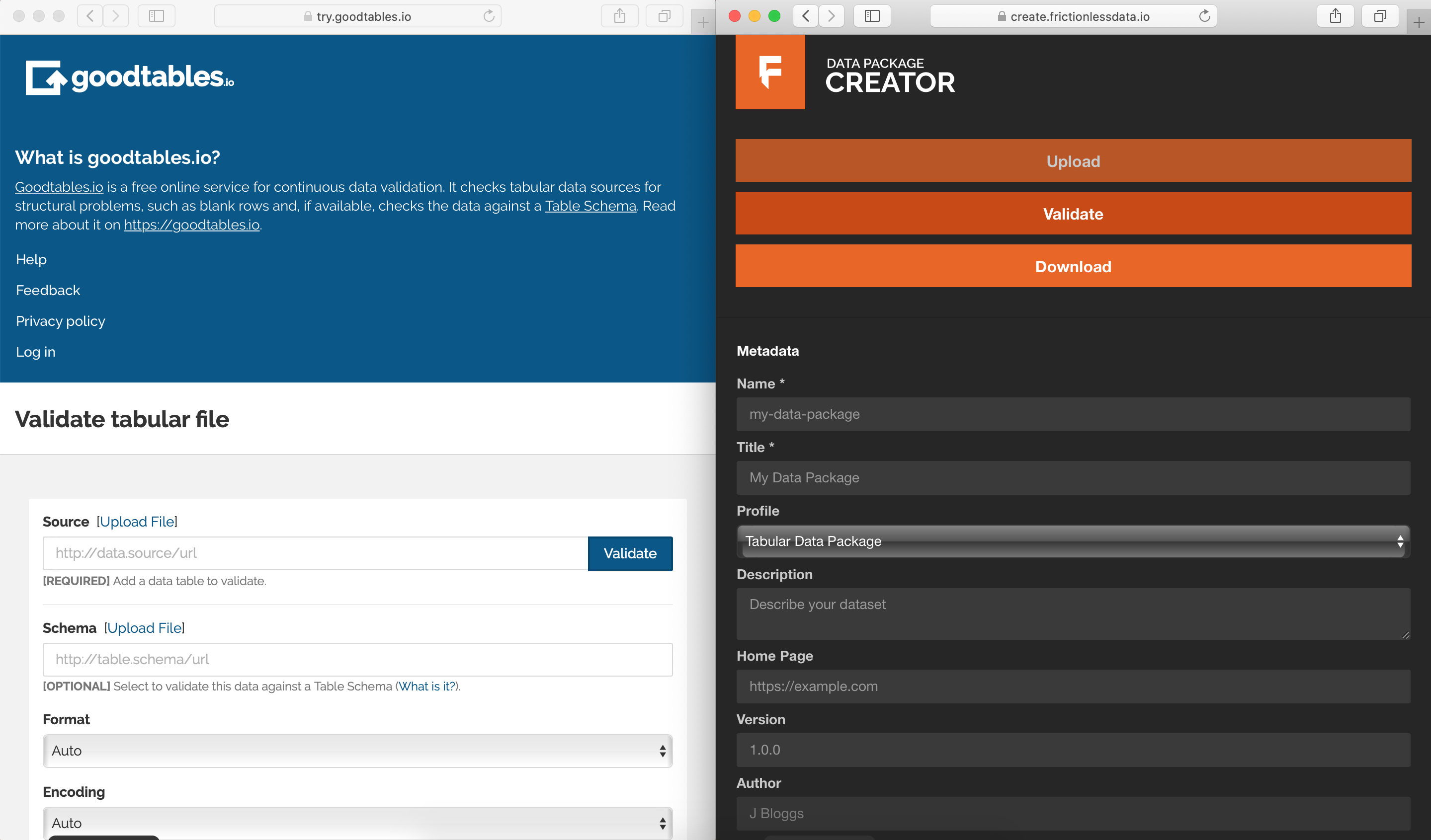
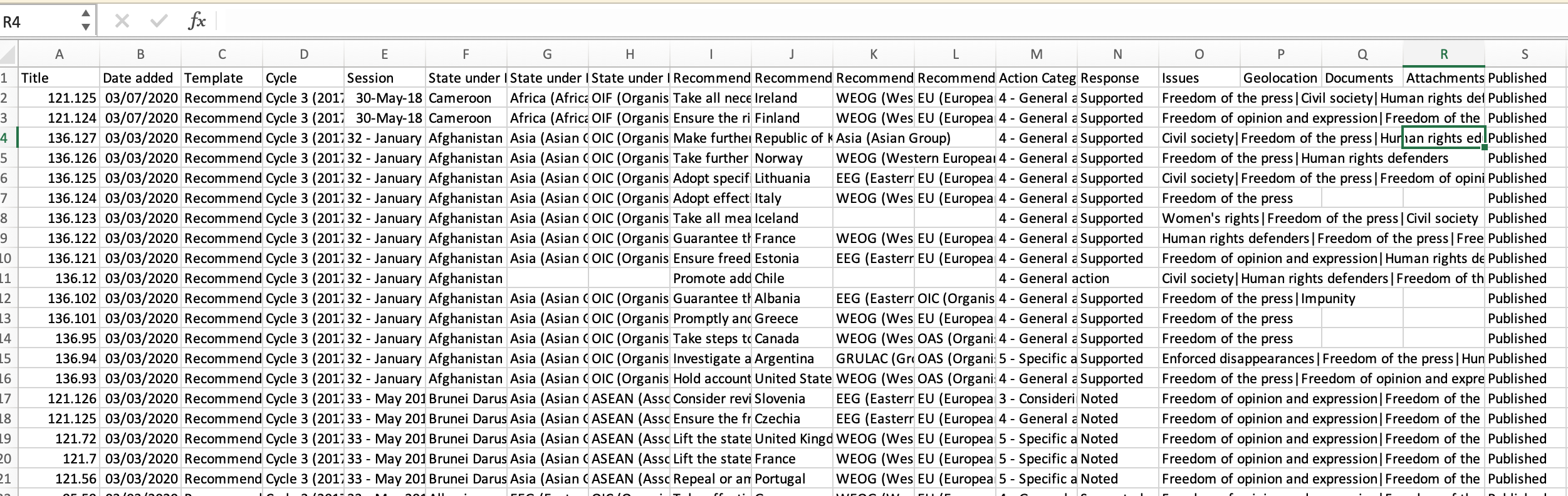
Creating my ‘data-package’ with the Open Knowledge Frictionless Data Toolkit was the first step in this process, especially in terms of translating this information for another researcher or user (ie. a journalist or a citizen scientist). After downloading a few sample datasets from the UPR Info website, I first validated them (in other words, checked if anything might be off about their formatting) on Good Tables.io. Afterwards, I followed the formatting standards available on the Frictionless website, and uploaded a selection to the handy Data Package Creator tool to help me get started.
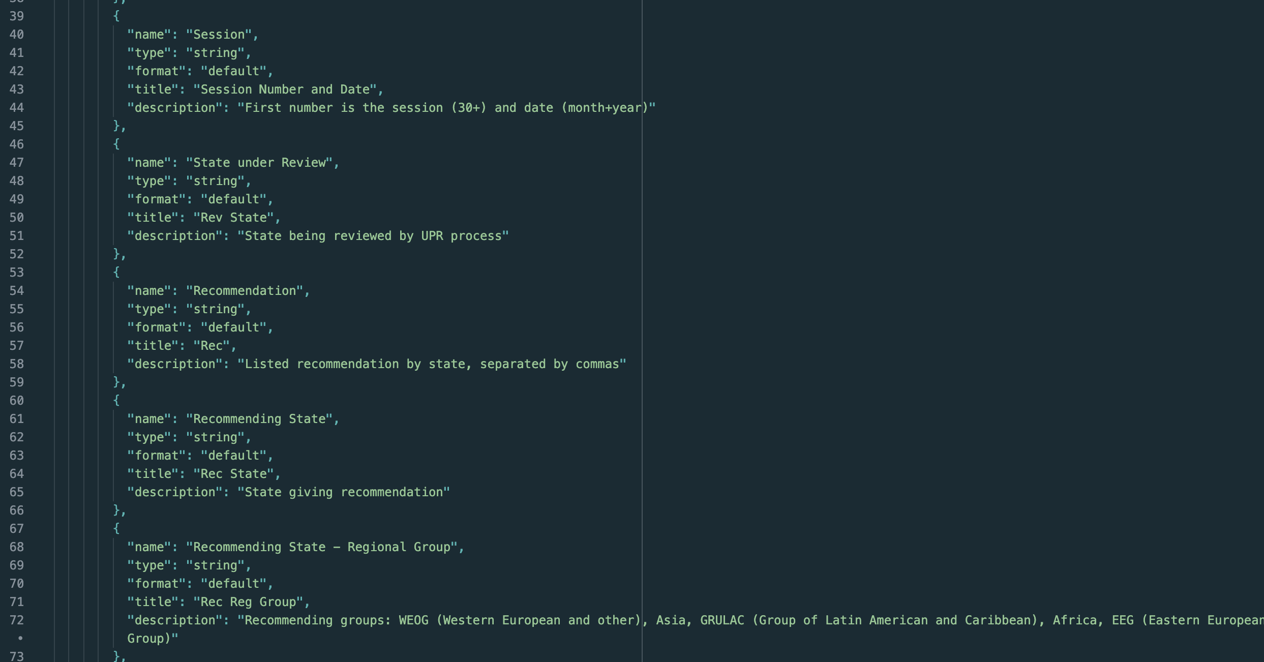
The way I think about it, the Data Package is a way of explaining the categories used within the data itself, in case someone besides an expert is using them. While sections like "Recommendation" and "Recommending State" may be somewhat self-explanatory, I can imagine that this will get way more complicated with purely numerical data. In many ways, I lucked out: the UPR data is pretty easy to understand, as well as formatted in a pretty straightforward manner. Because of this, I was able to use the 'data-package' to flesh out these titles in more of a detailed way, which I hope will be of use.
In the spirit of openness, I’ve uploaded both the 'data-package' file and a selection of the UPR data to github. For me, making this data-package was the first step in transitioning from 'open data' to 'accessible' data, which is why it's so important.